How AI-Powered Web Design Can Improve Website Conversion Rates
Your website is getting visitors. BUT are they becoming customers?
Your website may have attractive banners, good products, and a steady flow of traffic. Yet, GA4 observes people browsing, hesitating, and leaving your website. Some abandon a form halfway through. Others reach the product page but never complete their purchase. Getting attention is only the beginning; helping visitors is the next step—are you helping your customers get what they want?
Helping your customers requires a closer look at their experience.
And AI powered web design can offer the help that your customers are seeking. By analyzing how people interact with your website, AI-assisted tools help identify obstacles and suggest changes worth implementing. These changes could involve your landing page, headline, CTA, inquiry form, or the customer journey to checkout.
So, how does this work on the ground?
Let’s explore how AI-assisted analysis supports high-converting website design and helps your existing traffic work harder for your online business.
What AI-Powered Web Design Really Means
An AI-generated website and an AI-optimized website are two different things.
An AI website or app builder may create a layout within minutes. But improving conversions requires understanding what happens after visitors arrive—how will you create conversion paths?
AI can help you in this—summarize behavioral data, organize customer feedback, generate alternative copy, and recommend relevant products. Our designers can then use these concrete insights to make relevant changes.
AI eCommerce optimization consists of applications across UX analysis, content, personalization, and the A/B testing cycle, but it is faster and more scalable. However, an AI suggestion is still a starting point. It needs checking against your customers’ needs and actual results.
First, define your conversion. Is it a completed purchase, a booked consultation, or a qualified inquiry? A design cannot be judged properly until you know which action matters.
Understand Your Visitors’ Stuck Points

Before changing your website, listen to your visitors’ behavior. Let the AI read it and research it in depth.
Analytics can reveal where people leave. Session recordings show how they interact with a page, while heatmaps show patterns in clicking and scrolling. AI can make reviewing this information more manageable and faster. Now, you don’t need to spend hours understanding the situation, but you do need the right knowledge to make it work efficiently for you.
Imagine visitors repeatedly clicking a product image that does not open. They may expect a larger view while hovering or clicking. Or mobile users might stop before reaching a form hidden below a long introduction.
These are clues, not proof of what someone is thinking. Check the recordings, compare devices, and ask users for feedback. That combination gives your design decisions a stronger foundation.
Make Landing Pages Match Customer Expectations
Suppose someone clicks an advertisement for custom office furniture. Your landing page opens with a general company introduction and a slideshow of unrelated services. The visitor now has to search again for the offer that attracted them.
That gap can cost you an inquiry.
AI-assisted analysis can help compare campaign messages, landing page content, and performance across visitor groups. It can flag mismatches and suggest a more relevant headline, image, or arrangement of information.
As Unbounce’s landing page optimization guide explains, maintaining continuity between an advertisement and its destination helps meet visitors’ expectations.
In the case of a furniture business, a suitable example would be a useful test that would place the custom furniture offer, relevant project images, and a quotation button (call to action) near the top. Supporting details can follow as visitors scroll.
Keep each campaign page focused on its main goal. Then measure completed inquiries to see whether the clearer page helps visitors act.
Write Headlines That Answer The First Question

It should answer, “What can this business do for me?”
Your headline, be it on the hero banner or product page details, should answer that question. Broad claims such as “Innovative Solutions for Modern Businesses” leave visitors to think all by themselves; it doesn’t hit the right spot. This type of banner also gives the impression of “benefiting themselves” to the customers or visitors.
AI can help organize anonymized customer inquiries and survey responses into recurring needs. A copywriter can then use those themes to develop several headline options that reflect the language customers actually use while melding your brand’s image.
Let’s take an example of a booking software company. If customers repeatedly ask about missed appointments, “Help Reduce Missed Appointments With Automated Reminders” gives them something specific to consider. Then the business must, of course, offer that feature.
Test the relevant promise rather than generating dozens of similar slogans, and make sure business offerings are perfectly aligned with them. Review every version for accuracy and brand voice. Persuasive headline copy should make your offer easier to understand in lucid language without adding claims your business cannot or would not support.
Make Calls To Action Clear And Useful
A call to action or CTA connects the interest of your potential customer with the next step. Its wording should explain what visitors will receive or do next.
“Request a Project Quote” tells a different story from “Submit” or “Contact Us.” Similarly, a visitor comparing services may need to “View Our Work” before feeling ready to speak to someone in your company.
AI can help draft alternatives based on the page’s purpose and summarize behavior around existing buttons. Your team can test wording or placement and examine what happens afterwards.
Let’s understand this with a situation where you want to throw a lifesaver, and it ends up hitting someone in the head.
Think of a visitor who clicks “Check Availability” and lands on a long sales enquiry form.
The button may attract clicks, but the next screen breaks their expectation, and your brand may risk losing trust or credibility. Therefore, make sure that the destination matches the action promised.
Here is what you can do:
- Give the main CTA enough space and contrast
- Check the click result on mobile
- Measure completed actions.
Remember, a popular CTA button is only useful when it supports the business goal.
Forms—Make It Easily Fillable
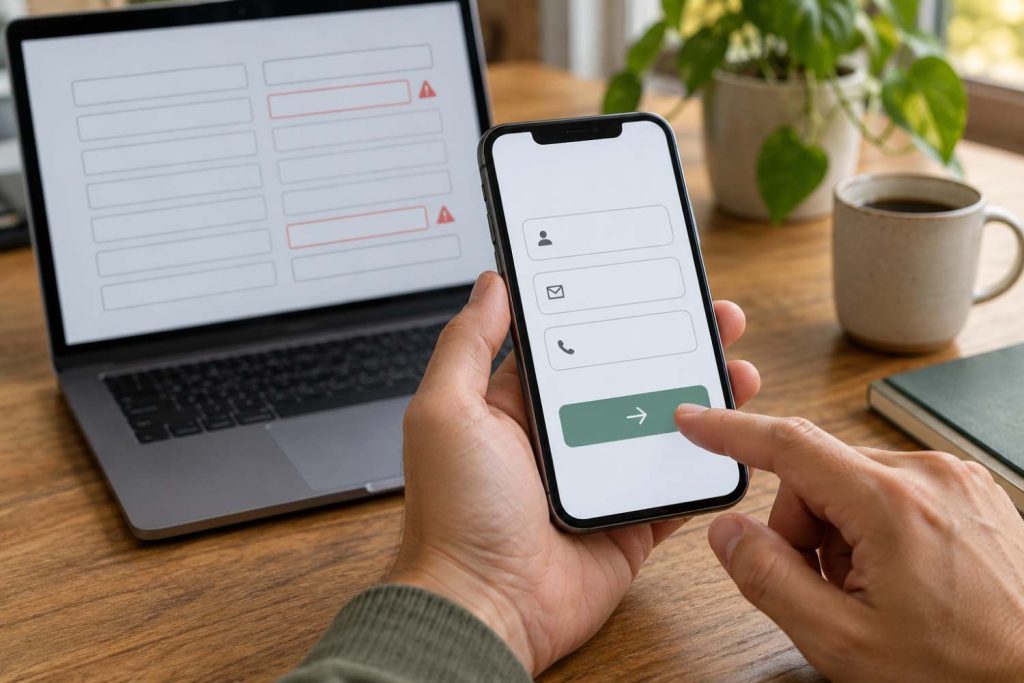
Congratulations, you have finally convinced someone to contact you. You want them to fill out a form with all the necessary information that you need to be in touch. Now, how much work are you asking them to do?
If it’s a lot, they may lose interest!
A form requesting a full address, job title, and detailed company information for a simple callback may discourage interested visitors. Baymard Institute’s research into form design highlights how excessive fields and confusing layouts create difficulties during checkout. According to their research, they found that 17% of users abandon a cart in the previous quarter due to a checkout form that was perceived to be too long or complicated. During usability testing, participants became intimidated by checkout forms with 10 to 15+ fields.
With suitable tracking, our AI-assisted analysis helps summarize where users stop, which fields trigger repeated errors, and whether mobile visitors struggle more often. Our team can then further investigate those points and test a simpler version.
Useful changes may include:
- Removing fields that are unnecessary at this stage
- Keeping labels visible as people type
- Explaining errors beside the relevant field
- Showing a clear confirmation after submission.
Our team then checks lead quality because more submissions are not necessarily better if your sales team cannot use them.
Recommend The Right Products
A customer looking at a compact desk may appreciate a suitable chair or storage unit. A collection of unrelated bestsellers gives them more browsing to do. And more options mean confusion and no less sales.
Recommendation models can use product information and visitor interactions to suggest items that are more relevant. Amazon Personalize documentation, for example, explains how supported recommendation models update suggestions as users interact with a catalogue.
For an online store, this could support similar products on a product page or compatible accessories in the basket. Keep recommendations selective and make essential information, such as price and availability, easy to see.
New visitors may have little browsing history. Relevant category suggestions provide a useful fallback. Keep normal search and navigation available too, as shoppers should remain free to explore.
Smooth Conversion Path—Ensure Zero Roadblocks
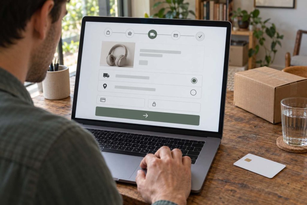
Map the route from arrival to completion. For a service business, that could be a landing page, portfolio, inquiry form, and confirmation. For a product business, it may include product selection, basket review, delivery details, and payment.
AI helps you summarize drop-off patterns across these stages. This helps the team to further investigate the likely cause. A sudden exit at delivery selection, for instance, may relate to an unexpected charge or unavailable delivery option. Rewriting the product headline will not address this problem. Therefore, it is vital to check every roadblock that may appear during this journey.
In a nutshell, it is best to become a customer yourself from time to time and experience what your customers are experiencing to understand what you should (not) do.
Test The Changes And Measure What Really Matters
Start with one important page and one clear hypothesis, work around it, and build a test on it.
An A/B test compares versions using separate visitor groups. Decide on the main success measure or objective and testing requirements before starting. Then, allow enough traffic and time for a reliable result. Yukti Digital tracks business outcomes that mainly include:
- Completed purchases or qualified inquiries
- Form and checkout completion rates
- Revenue per visitor (ROI) or lead quality.
If traffic is limited, our professionals focus first on usability checks and clear technical problems. Keep customer information protected when using analytics and AI tools and verify suggestions before publishing changes.
AI can speed up parts of the work, but it is the human judgement that keeps your work connected to your customers.
We Understand AI—Let Us Help Your Visitors
We have extensive experience working with AI and understand how, when, and why to use it effectively.
Yukti Digital offers secure and efficient AI-powered web design services that create attractive, effective websites while helping you identify problems, test improvements, and learn from the results. Talk to our team today about high-converting website design and improvements that matter for your website.